 Customisation & Publishing
Branding & Writing Colours
Docvora's colours can be changed to match a brand. Branding colours cover the site itself, such as the header, buttons and backgrounds. Writing colours cover text, links and the colours writers can use in the editor.
Brand customisation is available on Pro and Enterprise plans and requires the Edit Settings staff permission.
Changing colours
Navigate to Staff Panel > Settings > Branding Colors or Writing Colors.
Select a colour swatch and choose a new colour. The colour's hex code updates as it changes.
Select Save colors.
The new colours apply across the whole site straight away.
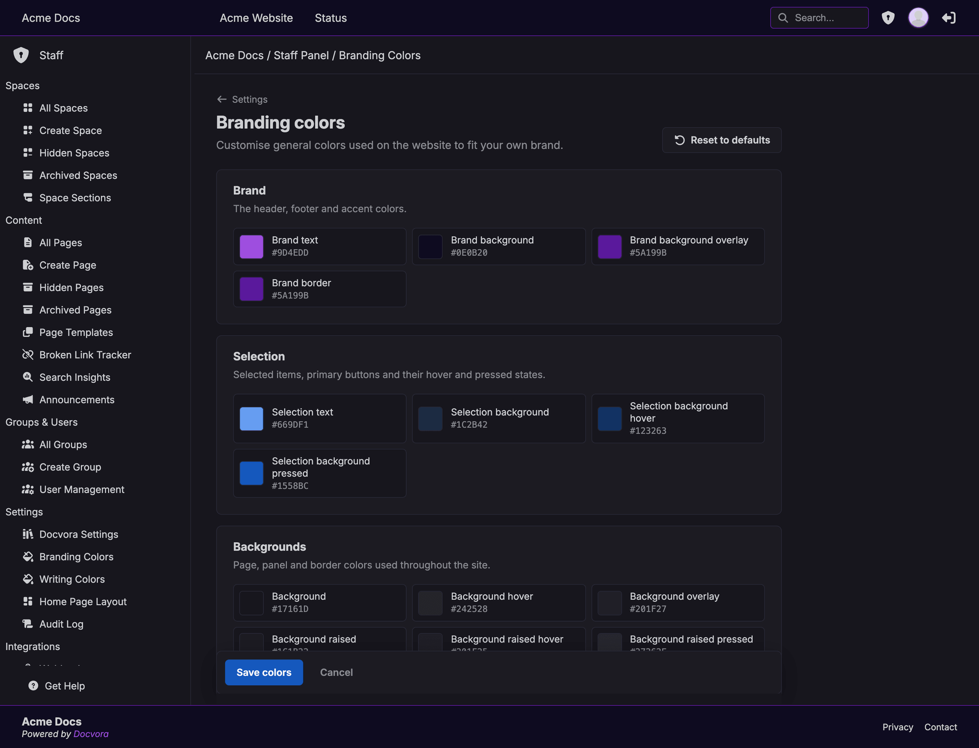
Branding colours
Brand: the header, footer and accent colours, including brand text, background, background overlay and border.
Selection: selected items and primary buttons, including their text, background, hover and pressed colours.
Backgrounds: page, panel and border colours used throughout the site, including raised panels and their hover and pressed states.
Writing colours
General text: the main text colour, a lighter alternate text colour, and link and visited link colours.
Editor text colors: the text colours writers can pick in the editor. Each colour (blue, teal, green, orange, red and purple) has three shades, plus two neutral shades.
Editor highlight colors: the highlight colours available in the editor. Announcement banners use these colours too.
Editor panels: the icon and background colours of information, note, success, warning and error panels.
Changing an editor colour updates every page that uses it, so pages stay consistent with the brand without being edited.
Choosing colours that work
Check that text stays easy to read on its background, especially for the Selection and Brand colours.
Keep panel backgrounds light enough for their text and icons to stand out.
Preview a few pages that use highlights and coloured text after saving.
Resetting colours
To go back to Docvora's default colours, select Reset to defaults on either colours page and confirm.
Resetting changes both branding and writing colours back to the defaults at once.